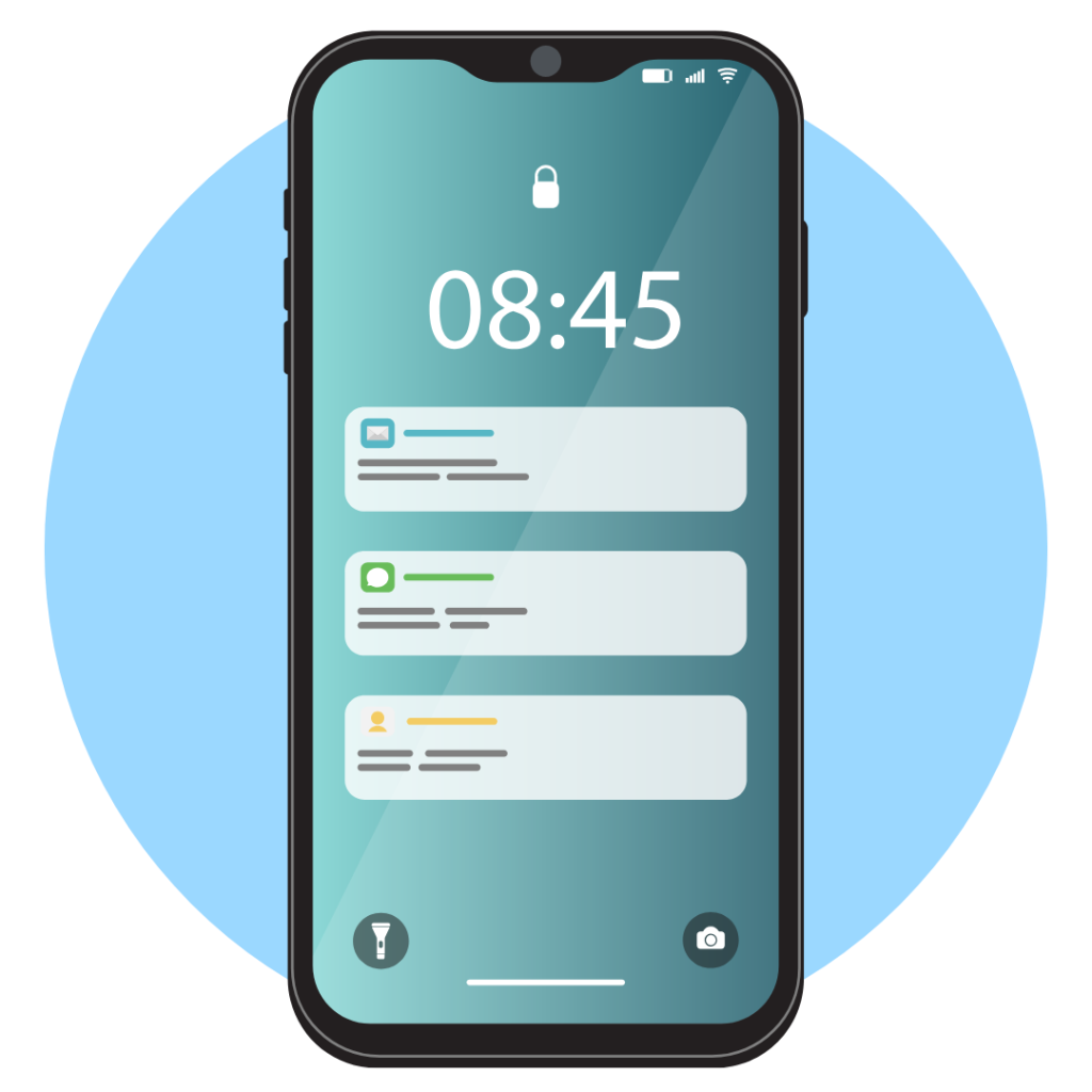
Risk and Early Warning Reports Dashboard | FireFlight
Last updated: April 2026

Risk and Early Warning Reports: See Problems Before They Cost You

Client credit watchlists, company credit exposure, and expense spike alerts : all from live data, so your team catches financial risk signals before they become cash flow problems.

FireFlight's Risk and Early Warning Reports Dashboard monitors Client Credit Risk, Company Credit Risk, and Expense Spike Alerts from live operational data. In 2026, the firms that catch financial risk early are the ones with a system watching for it continuously : not the ones reviewing an AR report at month-end and finding a problem that was visible three weeks ago. This dashboard watches the numbers so your team does not have to.
Risk and Early Warning Reports Dashboard :  catch financial risk before it becomes a problem

A client credit risk problem that surfaces at month-end close is a problem that had three weeks to get worse. The same expense overrun that looks manageable in week one looks like a significant variance by the time a report surfaces it. Early warning is only useful if it is actually early : and that requires watching live data, not reviewing periodic reports.

Schedule your free consultation

Why do credit risk problems keep showing up in the wrong report?

The pattern PCG has seen across 31 years of building financial and operations software is consistent: credit risk and expense overruns are not discovered late because nobody was paying attention. They are discovered late because the discovery mechanism is a periodic report that runs after the problem has already had time to grow. An accounts receivable aging report shows that a client is 60 days past due. What it does not show is that the same client was already showing unusual payment pattern shifts at 30 days that, had they been flagged at that point, would have prompted a conversation before the balance grew.

FireFlight's Risk and Early Warning Reports Dashboard addresses this by watching the signals that precede the problem rather than the problem itself. The Client Credit Risk Watchlist and Company Credit Risk Watchlist track behavioral indicators against defined thresholds : changes in payment patterns, shifts in outstanding balance relative to credit terms, and movements in the relationship between invoiced amounts and collections. When a threshold is crossed, the alert fires. Not at month-end. When it happens.

Expense Spike Alerts work on the same principle. A cost line that has moved significantly above its baseline is visible on the day it moves, not on the day the monthly variance report is reviewed. For environmental and industrial firms managing multiple compliance projects with distinct cost structures, catching an expense spike in week one versus week four is the difference between a manageable adjustment and a material budget overrun.

What the three watchlists actually monitor

The Client Credit Risk Watchlist tracks individual client accounts against configured risk thresholds : payment timing patterns, outstanding balance trends, and credit utilization relative to terms. The Company Credit Risk Watchlist applies the same logic at the company level, which matters for operations that work with parent-subsidiary relationships or multi-entity clients where risk aggregates across multiple accounts. Expense Spike Alerts monitor operational cost categories against their configured baselines and fire when a category crosses a defined threshold : whether that is a fixed dollar amount, a percentage above the rolling average, or a comparison against the prior cycle.

PCG configures all three watchlist parameters during deployment to match your actual client relationships and cost structure. A 30-person environmental consulting firm has different credit risk parameters than a 150-person industrial operator. The thresholds reflect your business rather than a generic financial template built for a different kind of operation. PCG has been building financial and compliance software for regulated industries since 1995.

Who uses this dashboard and what decisions does it change?

Finance managers use it to catch credit exposure before it becomes a collection problem. Seeing a client move onto the watchlist at 15 days of unusual payment behavior is actionable. Seeing the same client in a 60-day AR aging report is a collection problem that is already fully formed. The earlier the signal, the more options the team has for how to respond.

Operations managers use the Expense Spike Alerts to identify cost overruns in the week they occur rather than the month they are reported. For compliance-driven operations where project cost tracking is a documentation requirement, catching a spike in a specific cost category early means the variance can be investigated, documented, and addressed while the project is still in the window where correction is possible.

Leadership uses the combined view to understand where financial risk is building across the client base and the operational cost structure at the same time. A CFO or principal who opens the dashboard before a significant decision can see whether credit risk is concentrated in a particular client segment and whether any expense categories are currently running above threshold : both pieces of information that belong in a capital decision, and neither of which is available from a standard monthly report at the moment the decision is being made.

Ikhana on-screen guide
Meet Ikhana

Your Personal Guide on Every Page

From the first click to the final step, Ikhana, your on-screen tutor, shows you how it all works. Every field, every button, every page explained with clarity, right where you need it.

In the Risk and Early Warning Reports Dashboard, Ikhana guides finance managers and operations staff through reading credit watchlist indicators, interpreting expense spike alerts, and understanding what each threshold signal means for current decisions : without requiring a financial analyst background to act on what the dashboard is showing.

Learn more about Ikhana

Dashboard Highlights

  • FireFlight Client Credit Risk Watchlist - Tracks individual client accounts against configured risk thresholds. Payment timing shifts, outstanding balance trends, and credit utilization changes are flagged when they cross defined parameters : before a 30-day balance becomes a 90-day collection problem.
  • FireFlight Company Credit Risk Watchlist - Applies credit monitoring at the company level, aggregating exposure across multiple accounts within the same entity. For operations working with parent-subsidiary relationships or multi-location clients, this surfaces risk that individual account monitoring would miss.
  • FireFlight Expense Spike Alerts - Monitors operational cost categories against their configured baselines and fires when a category crosses a defined threshold. For compliance-driven operations tracking project costs, a spike alert in week one is a manageable investigation. The same spike found in the monthly variance report is a budget overrun.
  • FireFlight Live data : no scheduled report cycle - All three watchlists update automatically from connected FireFlight financial systems. When a transaction posts, when a payment is received or missed, when an expense entry is recorded : the dashboard reflects it without a manual refresh or a report run.
  • FireFlight Thresholds configured to your operation - Risk parameters and expense spike levels are set during deployment to match your actual client relationships and cost structure. A generic threshold that fires on every minor variation is not useful. PCG configures the watchlists to surface signals that are actually worth acting on for your specific business.
  • FireFlight Combined risk view for leadership decisions - Credit risk and expense spike information on the same screen means a principal or CFO can assess financial risk across both the client base and the cost structure before a significant decision : rather than pulling that picture from two separate reports that were produced at different times.

What PCG has learned across 31 years of financial risk and operations software implementations

The firms that manage credit risk well share one operational characteristic: they have a system watching for early signals continuously, not a team reviewing periodic reports. The difference is not the quality of the analysis : it is the timing. A credit risk signal caught at 15 days of unusual behavior has three to four response options available. The same signal caught at 60 days in an AR aging report has one: pursue collection on a balance that has already grown for two months. Early warning systems work because they change when the information arrives, not how sophisticated the analysis is.

The second consistent finding: expense spike alerts are most useful when the thresholds are specific enough to be actionable. A dashboard that flags every cost variation above 5% of budget produces alert fatigue within two weeks. PCG configures spike thresholds during deployment based on actual cost patterns and operational norms : so alerts represent signals worth investigating rather than noise that trains the team to ignore them.

What changes when risk signals arrive before the problem is fully formed?

  • FireFlight Client credit conversations happen at 15 days of unusual payment behavior rather than at 60 days when the balance has grown and the relationship has already been affected by the silence.
  • FireFlight Expense overruns on compliance projects are identified in week one, when the scope of the variance is still small enough to investigate and document before it becomes a budget finding.
  • FireFlight Multi-entity credit risk that would be invisible in individual account monitoring surfaces on the Company Credit Risk Watchlist : so exposure aggregated across a parent and its subsidiaries is visible before it becomes a collection problem at the relationship level.
  • FireFlight Finance managers spend less time in AR aging reports looking for problems and more time responding to specific flagged accounts : because the dashboard has already identified which ones need attention.
  • FireFlight Leadership decisions that involve financial risk exposure are made with a current watchlist view rather than a monthly summary that reflects conditions from the prior reporting period.
  • FireFlight Month-end close produces fewer surprises because the signals that typically surface as month-end variances have already been flagged, investigated, and either resolved or documented during the month they occurred.

Frequently Asked Questions

FireFlight What does the Risk and Early Warning Reports Dashboard track? +
The dashboard monitors Client Credit Risk, Company Credit Risk, and Expense Spike Alerts from live operational data. These three watchlists surface financial risk signals before they become cash flow problems : flagging clients or companies whose credit exposure has moved, and operational expense lines that have spiked beyond normal thresholds. No manual review required to catch them.
FireFlight How is a credit risk watchlist different from a standard accounts receivable report? +
An AR report shows what is owed and how old it is. A credit risk watchlist tracks behavioral signals that precede a payment problem : changes in payment patterns, increases in outstanding balances relative to credit limits, and shifts in the relationship between invoiced amounts and collections. The watchlist surfaces risk earlier, when there is still time to act on it.
FireFlight What triggers an Expense Spike Alert? +
PCG configures the spike thresholds during deployment based on your actual expense patterns and operational norms. An alert fires when a specific expense category crosses a defined threshold relative to its baseline : whether that is a fixed dollar amount, a percentage above the rolling average, or a comparison against the same period in a prior cycle. The thresholds reflect your business, not a generic template.
FireFlight Does this dashboard update in real time or on a scheduled basis? +
It pulls from live FireFlight data and updates automatically when underlying financial records change. When a new invoice posts, when a payment is received or missed, when an expense entry is recorded : the watchlists and alerts reflect that change without a manual refresh or a scheduled report run.
FireFlight Who should be looking at this dashboard : finance, operations, or leadership? +
Finance managers use it to catch credit exposure before it becomes a collection problem. Operations managers use the Expense Spike Alerts to identify cost overruns as they happen rather than at month-end close. Leadership uses the combined view to understand where financial risk is building across both the client base and the operational cost structure at the same time.
FireFlight Can the risk thresholds be customized for our client base? +
Yes. The credit risk watchlist thresholds and expense spike alert levels are configured during deployment to match your specific client relationships and cost structure. A 30-person environmental consulting firm has different credit risk parameters than a 150-person industrial operator. PCG builds the configuration to reflect your actual risk exposure rather than applying a standard template.
FireFlight How long does it take to get this dashboard configured and live? +
PCG configures FireFlight dashboards in weeks, not months. A Risk and Early Warning Reports Dashboard deployment typically runs 6 to 10 weeks depending on the number of watchlist categories, the complexity of the threshold configuration, and the financial systems being connected. The dashboard goes live against real data, not sample data.

If your team is finding credit risk problems in the monthly AR aging report and expense overruns in the month-end variance review, the discovery mechanism is three to four weeks behind the signal. FireFlight's Risk and Early Warning Reports Dashboard moves that discovery to the day the signal fires. PCG deploys in weeks, not months, and Allison takes every call personally.

Schedule your free consultation

Allison Woolbert
Allison Woolbert
Principal, Phoenix Consultants Group  |  Developer, FireFlight Data Systems

PCG founded 1995. 500+ applications built across 31 years, roughly one-third in regulated environments where software failure carries direct operational and compliance consequences. FireFlight is the platform built from that body of work. When you contact PCG, Allison is the person who answers.

phxconsultants.com LinkedIn

FireFlight Data Systems is a product of Phoenix Consultants Group. PCG founded 1995. All system configurations are custom-built for each deployment. Implementation timelines, module availability, and integration scope vary by organization. Contact PCG directly to discuss requirements specific to your operation.

Risk & Early Warning Reports Dashboard

 Track better. Serve smarter. Retain longer.

Operational Efficiency Reports Dashboard | FireFlight
Last updated: April 2026

Operational Efficiency Reports: Five Reports That Show Where Work Slows Down

Revenue per Employee, Project Overrun, Cycle Time, and Cost-to-Serve : live from operational data, so leadership sees where efficiency is breaking down before it shows up in the financials.

FireFlight's Operational Efficiency Reports Dashboard delivers five reports from live data: Revenue per Employee, Project Overrun Report, Operational Cycle Time Metrics Report, Operational Cycle Time Report, and Cost-to-Serve Report. In 2026, environmental and industrial firms running 15 to 50 concurrent projects need operational visibility that surfaces problems while they are still correctable : not after they have already affected billing, client relationships, or margin.
Operational Efficiency Reports :  from hours to invoices, track and allocate with full auditability

An overrun that surfaces in the weekly project status meeting is a problem with options. The same overrun that surfaces in the month-end financial close is a problem with a fully formed cost that nobody caught while the work was still running. Operational efficiency reporting is only useful if it arrives in time to change the outcome : and that requires live data, not periodic summaries.

Schedule your free consultation

What do five operational reports tell you that a standard project dashboard does not?

A standard project dashboard shows status, milestones, and sometimes cost-to-date. What it typically does not show is the operational efficiency picture : whether the business is converting labor into revenue at the right rate, how current project costs compare to approved budgets across the full portfolio, how long work is taking relative to the baseline, and what the fully loaded cost of each service type actually is against what is being charged for it.

Those five questions map directly to the five reports in this dashboard. Revenue per Employee answers the productivity question. The Project Overrun Report answers the portfolio budget question. The Operational Cycle Time Report and Metrics Report answer the process speed question. The Cost-to-Serve Report answers the service economics question. Together they give operations leadership a current view of efficiency that a standard project dashboard does not surface : and each one connects to a specific operational decision rather than serving as background information that gets reviewed once a quarter.

For environmental consulting firms managing compliance projects alongside advisory work, and for industrial EHS operators running inspection schedules across multiple facilities, the five reports together identify where the operation is functioning well and where it is not : at a level of specificity that allows the relevant manager to act on the finding rather than just note it.

See operational gaps and strengthen your plan with FireFlight efficiency reports

The Operational Cycle Time Metrics Report aggregates individual project cycle times into summary statistics : average, median, and variance by project type or service category. When the variance on a specific service category is consistently high, it is a signal that the process for that type of work is less predictable than it should be, which affects scheduling, capacity planning, and client commitments.

The Cost-to-Serve Report works alongside this by showing whether the service types with high cycle time variance are also the ones where the cost to deliver has drifted above the rate being charged. The two reports together identify a different problem than either one alone.

Why Cost-to-Serve matters specifically in compliance-driven operations

Environmental consulting firms and industrial EHS operators often price compliance project types based on historical cost data : rates set during a proposal process that may reflect conditions from one or two years prior. If labor costs, overhead, or subcontractor rates have changed since those rates were established, the current cost to deliver a remediation assessment or an air permit compliance review may be materially higher than the rate being charged for it. The Cost-to-Serve Report surfaces that gap using live cost data rather than waiting for a margin squeeze to appear in the annual P&L.

PCG has been building financial and project management software for regulated industries since 1995. The firms that catch cost-to-serve drift early are the ones that revise rates before a pricing problem compounds across multiple billing cycles : not the ones that discover it when a client segment has been underpriced for 18 months and the fix requires a difficult rate conversation rather than a routine renewal adjustment.

How does Revenue per Employee connect to hiring and capacity decisions?

Revenue per Employee is a blended productivity indicator : not a performance metric for individual staff, but a signal for whether the operation is generating enough revenue per person to cover its cost structure at the current headcount. For a 30-person environmental firm where each additional hire adds a significant fully loaded cost to annual overhead, the Revenue per Employee indicator tells the principal whether the current team is running at a utilization level that supports that addition or whether the existing capacity is still under-deployed.

The metric is most useful when it moves. A Revenue per Employee figure that is declining over three consecutive months while headcount is stable is a signal that either revenue is softening, billable utilization is dropping, or both. An operations director who sees that movement in the dashboard can investigate the cause and act on it rather than discovering the trend at the quarterly review when it is already established.

For firms where capacity decisions are made against a rolling 90-day forward project pipeline, Revenue per Employee provides the financial anchor that the pipeline view alone does not give. A full pipeline does not guarantee Revenue per Employee at the level the cost structure requires : billable rates, project margin, and staff utilization all affect the relationship between headcount and revenue. The indicator holds all of those together in a single current number.

Ikhana on-screen guide
Meet Ikhana

Your Personal Guide on Every Page

From the first click to the final step, Ikhana, your on-screen tutor, shows you how it all works. Every field, every button, every page explained with clarity, right where you need it.

In the Operational Efficiency Reports Dashboard, Ikhana guides operations managers, project leads, and principals through reading each report, understanding what cycle time variance and cost-to-serve drift mean for current decisions, and knowing which report to consult before which type of operational call : without requiring a data analyst to interpret the output.

Learn more about Ikhana

The five reports: what each one shows

  • FireFlight Revenue per Employee - Current period revenue divided by active headcount, updated continuously from live billing and HR data. A blended productivity indicator that anchors hiring, capacity, and utilization decisions in a current financial number rather than in prior-period actuals or headcount ratios alone.
  • FireFlight Project Overrun Report - Tracks which projects are currently tracking over approved budget, by how much, and when the overrun began. Surfaces overruns in the week they start rather than at month-end close : so operations leadership has the window to investigate cause and act before the cost is fully formed.
  • FireFlight Operational Cycle Time Report - Tracks elapsed time between defined operational start and end points for active and recently completed projects. Compares actual cycle times against the configured baseline so operations leadership can see where specific projects or project types are running slow before the delay affects billing or client commitments.
  • FireFlight Operational Cycle Time Metrics Report - Aggregates individual cycle time data into summary statistics : average, median, and variance by project type or service category. High variance on a specific category signals a process that is less predictable than the scheduling and capacity model assumes, which affects how future work of that type should be quoted and staffed.
  • FireFlight Cost-to-Serve Report - Calculates the fully loaded cost of delivering each service type or project category against live cost data : labor, overhead allocation, materials, and subcontractor costs combined. Surfaces the gap between actual delivery cost and the rate being charged before it becomes a sustained margin problem, not after it has compounded across multiple billing cycles.

What PCG has learned across 31 years of operational reporting implementations

The most consistent pattern across three decades of building operational software for project-based and compliance-driven firms: the reports that change behavior are the ones that arrive while the behavior can still change. A Project Overrun Report that surfaces on day 8 of a 30-day project produces a different response than the same report at day 28. The finding may be identical. The available responses are not. PCG builds operational reporting deployments around this principle : the configuration work during setup is largely about identifying which metrics need to arrive early enough to be actionable rather than informational.

Cost-to-Serve drift deserves specific attention for firms that price compliance and environmental services. PCG has built cost tracking systems for remediation firms, air quality consultants, and industrial EHS operations since 1995. The rate structures in those businesses are often set at contract or proposal time and reviewed infrequently. Meanwhile, labor costs, regulatory complexity, and subcontractor rates change continuously. The Cost-to-Serve Report running against live data is the mechanism that flags when a service type's delivery cost has moved above its pricing : which is a different and more actionable finding than discovering the same problem in an annual margin review.

What changes when operational efficiency reports run on live data?

  • FireFlight Project overruns are identified in the week they begin : when scope adjustment, resource reallocation, or client communication can still change the outcome : rather than at month-end when the cost is already recorded.
  • FireFlight Cost-to-Serve drift on specific service types surfaces in the reporting dashboard before it compounds across multiple billing cycles : so rate adjustments happen at renewal rather than after an 18-month margin squeeze.
  • FireFlight Cycle time variance on specific project categories becomes visible as a pattern rather than as individual project delays : which changes how future work of that type is quoted, staffed, and scheduled.
  • FireFlight Hiring and capacity decisions are anchored to the current Revenue per Employee indicator rather than to prior-period ratios that may not reflect the current utilization and billing environment.
  • FireFlight Operations leadership enters project status meetings with the overrun and cycle time data already visible : so the meeting produces decisions rather than information gathering.
  • FireFlight Month-end financial reviews produce fewer operational surprises because the efficiency problems that typically surface as period-end variances have already been identified and addressed during the period they occurred.

Frequently Asked Questions

FireFlight What reports are included in the Operational Efficiency Reports Dashboard? +
The dashboard includes five reports: Revenue per Employee, Project Overrun Report, Operational Cycle Time Metrics Report, Operational Cycle Time Report, and Cost-to-Serve Report. Each pulls from live FireFlight data and updates automatically. Together they give operations leadership a current view of how efficiently the business is converting labor and cost into billable output.
FireFlight What is a Cost-to-Serve Report and why does it matter for environmental and industrial firms? +
The Cost-to-Serve Report calculates the fully loaded cost of delivering a specific service type or project category : including labor, overhead allocation, materials, and subcontractor costs. For environmental consulting and industrial EHS firms, compliance project pricing is often set at proposal time and not revisited. If the actual cost to deliver a service type has drifted above the rate being charged, the Cost-to-Serve Report surfaces that gap against live data rather than waiting for a margin squeeze to appear in the P&L.
FireFlight What does Operational Cycle Time actually measure? +
Cycle time measures elapsed time between defined operational start and end points : from project initiation to delivery, from intake to first billable output, or from work order creation to completion, depending on how your operation is configured. The Operational Cycle Time Report tracks actual cycle times against baseline. The Metrics Report aggregates those into summary statistics so operations leadership can see where the process is running slow before it creates a client or billing problem.
FireFlight How is Revenue per Employee calculated in this dashboard? +
Revenue per Employee divides current period revenue by active headcount, updated continuously from live billing and HR data in connected FireFlight systems. It is a blended productivity indicator : not a performance metric for individuals, but a signal for whether the operation is generating enough revenue per person to cover its cost structure at the current headcount. For firms considering a hire or evaluating capacity, the current figure gives that decision a financial anchor.
FireFlight What does the Project Overrun Report show that a standard project cost report does not? +
A standard project cost report shows what was spent. The Project Overrun Report shows which projects are currently tracking over budget, by how much, and when the overrun began : so operations leadership can identify the pattern rather than just the result. For firms running multiple compliance projects simultaneously, a Project Overrun Report that identifies overruns in the week they start is a management tool. The same report at month-end is a post-mortem.
FireFlight Can these reports be filtered by project type, client, or service line? +
Yes. PCG configures the report filters and segmentation during deployment to match your operational structure. An environmental consulting firm can filter the Cost-to-Serve Report by project type. An industrial operator can segment cycle time metrics by facility or work order category. The reports reflect your actual operational breakdown rather than a generic template.
FireFlight How long does it take to get this dashboard configured and live? +
PCG configures FireFlight dashboards in weeks, not months. An Operational Efficiency Reports Dashboard deployment typically runs 6 to 10 weeks depending on the number of reports being configured, the data sources being connected, and the segmentation structure needed. The dashboard goes live against real operational data from day one.

If your operations team is finding project overruns, cost-to-serve drift, and cycle time problems in the monthly financial review rather than during the period they develop, the reporting is arriving too late to change the outcome. FireFlight's Operational Efficiency Reports Dashboard moves that discovery into the week the problem starts. PCG deploys in weeks, not months, and Allison takes every call personally.

Schedule your free consultation

Allison Woolbert
Allison Woolbert
Principal, Phoenix Consultants Group  |  Developer, FireFlight Data Systems

PCG founded 1995. 500+ applications built across 31 years, roughly one-third in regulated environments where software failure carries direct operational and compliance consequences. FireFlight is the platform built from that body of work. When you contact PCG, Allison is the person who answers.

phxconsultants.com LinkedIn

FireFlight Data Systems is a product of Phoenix Consultants Group. PCG founded 1995. All system configurations are custom-built for each deployment. Implementation timelines, module availability, and integration scope vary by organization. Contact PCG directly to discuss requirements specific to your operation.

Operational Efficiency Reports

From hours to invoices, capture everything.
Track and allocate time and money with full auditability.

Customer and Market Reports Dashboard | FireFlight
Last updated: April 2026

Customer and Market Reports: Track Better, Serve Smarter, Retain Longer

Customer Payment Behavior Report and client intelligence built from live data. so your team knows who pays on time, who has shifted patterns, and which relationships need attention before a problem is fully formed.

FireFlight's Customer and Market Reports Dashboard delivers the Customer Payment Behavior Report alongside client and market reports configured for your operation. In 2026, the difference between a client who has always paid late and a client who recently started paying late is an actionable distinction. one is a known variable in cash flow planning, the other is an early signal. This dashboard surfaces that difference from live billing data without waiting for an AR aging report to show the result.
Customer and Market Reports Dashboard. turn client data into strategy

A client whose payment behavior has shifted in the last 60 days is sending a signal before the problem becomes a balance sheet entry. Catching that shift when it starts requires a system that tracks behavior over time. not just a snapshot of what is currently overdue. The Customer Payment Behavior Report provides that longitudinal view from live data.

Schedule your free consultation

Why is knowing how a client pays different from knowing what they currently owe?

An accounts receivable report answers one question: what is currently outstanding and how old is it. The Customer Payment Behavior Report answers a different question: how does this client pay, and is that pattern changing. Those two questions require different data and produce different responses.

A client in the 30-day overdue bucket on the AR aging report might have been paying consistently at 30 days for three years. That is a known pattern. it affects the cash flow forecast, but it does not represent a changing risk. A client who paid on time for two years and has now been 30 days late for the past three invoices represents a different situation entirely. The AR aging report shows both clients in the same bucket. The Payment Behavior Report distinguishes them.

For environmental consulting firms managing compliance project billing across a varied client base, and for industrial EHS operators with long-term service relationships across multiple facilities, the behavioral distinction shapes how each client relationship is managed. A collection call to a chronically-late-but-predictable client is a routine process. A proactive conversation with a previously reliable client whose behavior has shifted is a relationship management action that is most effective when it happens early. before the shift becomes a collection problem.

What the Customer Payment Behavior Report actually tracks

The report tracks payment timing relative to agreed terms across the client's full invoice history in FireFlight. For each client, it produces a behavior profile: average days to pay relative to terms, consistency across invoices, and trend direction over recent periods. A client who averages 5 days early with low variance across 40 invoices is a different profile from a client who averages 12 days late with high variance. Both are distinct from a client whose average has shifted from 0 to 25 days late over the past 6 billing cycles.

PCG has been building billing and client management software for regulated industries since 1995. The firms that manage receivables consistently are the ones whose finance teams know the behavioral profile of their client base. not just the current balance. That knowledge shapes collection prioritization, credit decisions, and cash flow forecasting in ways that a balance-based report alone does not support.

How does payment behavior reporting connect to cash flow planning and client decisions?

Cash flow forecasts built against invoice due dates assume that clients will pay on the due date. In practice, most clients pay according to their behavioral pattern. not according to the printed terms. A finance manager who knows that a specific client consistently pays 8 days after the due date can build a more accurate cash flow forecast than one who assumes all invoices will pay on time. The Payment Behavior Report provides the behavioral data that makes that adjustment possible without requiring the finance team to manually track each client's history.

Credit decisions. whether to extend terms, increase credit limits, or require advance payment. are better informed by behavioral history than by current balance alone. A client with a large outstanding balance who has a consistent on-time payment history represents a different risk than a client with the same balance and a pattern of late payments with increasing variance. The report makes that distinction visible before the credit decision is made.

Client retention and relationship management also benefit from behavioral visibility. Account managers who can see which clients have recently shifted from reliable payment to late payment can initiate a conversation at the point where the shift is just beginning. when the most likely cause is an internal process or cash flow issue at the client's end that a brief conversation could address. rather than after the relationship has been strained by a formal collection process.

Ikhana on-screen guide
Meet Ikhana

Your Personal Guide on Every Page

From the first click to the final step, Ikhana, your on-screen tutor, shows you how it all works. Every field, every button, every page explained with clarity, right where you need it.

In the Customer and Market Reports Dashboard, Ikhana guides finance managers and account managers through reading payment behavior profiles, identifying clients with recently shifted patterns, and understanding what each behavioral indicator means for cash flow planning and client relationship decisions. without requiring a data analyst to translate the report output into actionable terms.

Learn more about Ikhana

Dashboard Highlights

  • FireFlight Customer Payment Behavior Report - Tracks each client's payment timing relative to agreed terms across their full invoice history. Produces a behavioral profile showing average days to pay, consistency, and trend direction. so finance teams can distinguish between chronically-late-but-predictable clients and clients whose behavior has recently shifted.
  • FireFlight Behavioral trend detection - The report identifies clients whose payment pattern has changed in recent billing cycles. not just what is currently overdue, but whether the behavior underlying the balance is stable or shifting. A shift from consistent on-time payment to consistent late payment is visible as it develops rather than after it has established itself.
  • FireFlight Segmentation by client type, region, or status - Payment behavior analysis filtered by the client classification structure configured during deployment. Understand whether payment pattern differences follow client type, industry, region, or service category. which informs credit policy and collection approach at the segment level rather than only at the individual client level.
  • FireFlight Live data from connected billing systems - The report updates automatically as payments post. When a client makes a payment, the behavior record reflects it. When an expected payment does not arrive on the expected date, the pattern indicator updates. Finance teams see current behavior, not behavior as of the last manual report run.
  • FireFlight Full client relationship view alongside payment data - Payment behavior sits alongside the complete client record: contact history, active projects, outstanding quotes, and service activity. Finance and account teams see the payment picture in the context of the full relationship rather than in isolation from it.
  • FireFlight Cash flow planning input from behavioral history - Finance managers can build cash flow forecasts that reflect actual client payment patterns rather than invoice due dates alone. The behavioral data provides the adjustment factor that makes the forward view more accurate for the clients who consistently pay off-schedule.

What PCG has learned across 31 years of client management and billing software implementations

The most consistent finding across three decades of building billing and client systems for project-based operations: finance teams that know how their clients pay make better cash flow decisions than finance teams that only know what their clients currently owe. The behavioral data. average days to pay, consistency across invoices, trend direction. is produced by every billing system that tracks invoice issuance and payment receipt. The gap is almost never in the data. It is in whether the data has been organized into a view that makes behavioral patterns visible rather than just current balances.

The second consistent pattern: the most valuable moment to act on a changing payment behavior is in the early weeks of the shift, when the most likely causes are operationally addressable. a client process change, a temporary cash flow issue, an invoice that got routed incorrectly. PCG builds the Customer Payment Behavior Report with trend detection specifically because that early window is where the report is most useful. A behavior shift identified after 6 months is historical context. A behavior shift identified after 6 weeks is a proactive opportunity.

What changes when client payment behavior is visible as a pattern, not just a balance?

  • FireFlight Cash flow forecasts reflect actual client payment patterns rather than invoice due dates. which makes the forward view more accurate for the clients who consistently pay off-schedule.
  • FireFlight Collection conversations are initiated at the point when a behavioral shift is first detected. when the conversation is still a relationship check-in. rather than after the shift has become an established pattern and the conversation is a formal collection call.
  • FireFlight Credit decisions are based on behavioral history alongside current balance. so a client with a large outstanding balance and a consistent on-time payment history is treated differently from a client with the same balance and a pattern of late payments.
  • FireFlight Finance teams spend less time manually tracking individual client payment histories and more time acting on the behavioral signals the report surfaces automatically from live data.
  • FireFlight Account managers who see which clients have recently shifted payment behavior can flag those relationships for proactive outreach before the finance team initiates a collection process. which preserves the relationship context that a collection conversation tends to disrupt.
  • FireFlight Segment-level payment behavior analysis shows whether late payment patterns are concentrated in a specific client type, region, or service category. which informs credit policy at the portfolio level rather than requiring individual client reviews to find the pattern.

Frequently Asked Questions

FireFlight What does the Customer and Market Reports Dashboard track? +
The dashboard delivers the Customer Payment Behavior Report alongside the client and market reports configured for your operation during deployment. The Payment Behavior Report tracks how individual clients pay against their agreed terms over time. payment timing patterns, consistency, and trend direction. For operations managing compliance project billing across a varied client base, knowing which clients pay on time and which have recently shifted is directly relevant to cash flow planning and client relationship management.
FireFlight What is a Customer Payment Behavior Report? +
The Customer Payment Behavior Report tracks how each client pays relative to their agreed payment terms over time. It surfaces patterns: clients who consistently pay early, clients who pay on time, clients who consistently run late by a predictable number of days, and clients whose payment behavior has recently changed. A client who has always paid 10 days late is a known variable in cash flow planning. A client who used to pay on time and has shifted to 30-day late payments is a signal worth acting on. and those two situations look identical in an AR aging report.
FireFlight How is this different from a standard accounts receivable aging report? +
An AR aging report shows current balances by age bucket. The Customer Payment Behavior Report shows behavioral patterns over time. not just what is currently outstanding, but how this client has historically paid and whether that pattern is changing. A client currently in the 30-day bucket may have always been there, or may have recently shifted from paying on time. Those two situations require different responses, and the AR aging report does not distinguish between them.
FireFlight Can the dashboard filter by client region, status, or type? +
Yes. PCG configures the report filters and segmentation during deployment to match your client classification structure. Environmental consulting firms can segment payment behavior by client type. Industrial operators can filter by region or facility type. The segmentation reflects how your operation thinks about its client base rather than a generic contact list view.
FireFlight Who uses this dashboard. finance, sales, or operations? +
Finance managers use the Payment Behavior Report to prioritize collection conversations and adjust cash flow forecasts based on known client payment patterns rather than invoice due dates alone. Account managers use it to identify clients who need proactive payment communication before an invoice goes late. Operations leadership uses the market-level view to understand which client segments represent concentration risk in the revenue base.
FireFlight Does the dashboard update automatically as payment records change? +
Yes. The Customer Payment Behavior Report pulls from live FireFlight billing and payment data and updates automatically as transactions post. When a client makes a payment, the behavior record reflects it. When a payment does not arrive on the expected date, the pattern indicator updates. Finance teams see current payment behavior, not behavior as of the last time someone ran a manual report.
FireFlight How long does it take to get this dashboard configured and live? +
PCG configures FireFlight dashboards in weeks, not months. A Customer and Market Reports Dashboard deployment typically runs 6 to 10 weeks depending on the client segmentation structure, the payment behavior parameters, and the billing systems being connected. The dashboard goes live against real client and payment data from day one.

If your finance team is managing receivables from an AR aging report alone, the behavioral signals that precede collection problems are not visible until they have already become collection problems. FireFlight's Customer and Market Reports Dashboard surfaces payment behavior patterns from live data while there is still time to act on them. PCG deploys in weeks, not months, and Allison takes every call personally.

Schedule your free consultation

Allison Woolbert
Allison Woolbert
Principal, Phoenix Consultants Group  |  Developer, FireFlight Data Systems

PCG founded 1995. 500+ applications built across 31 years, roughly one-third in regulated environments where software failure carries direct operational and compliance consequences. FireFlight is the platform built from that body of work. When you contact PCG, Allison is the person who answers.

phxconsultants.com LinkedIn

FireFlight Data Systems is a product of Phoenix Consultants Group. PCG founded 1995. All system configurations are custom-built for each deployment. Implementation timelines, module availability, and integration scope vary by organization. Contact PCG directly to discuss requirements specific to your operation.

Customer & Market Reports Dashboard

Track better. Serve smarter. Retain longer.

Scenario and Sensitivity Analysis Dashboard | FireFlight Data Systems
Last updated: April 2026

Scenario and Sensitivity Analysis: Know What Could Happen Before It Does

Best-case and worst-case cash flow projections built on live operational data : so your team models financial exposure in real time, without waiting for a report cycle.

FireFlight's Scenario and Sensitivity Analysis Dashboard shows best-case and worst-case cash flow projections alongside the sensitivity variables that drive them. In 2026, operations and finance teams at environmental and industrial firms need to stress-test financial decisions against live data : not last quarter's spreadsheet export. This dashboard delivers that without a manual update step.
Scenario and Sensitivity Analysis Dashboard :  the pulse of your system always in view

Every financial decision made without a current best-case and worst-case model is a decision made with incomplete information. When a capital expenditure gets approved based on a spreadsheet model from six weeks ago, the risk is not that the model was wrong then : it is that conditions have changed and nobody updated the numbers. That gap is what this dashboard closes.

Schedule your free consultation

Why do financial models go stale before anyone uses them?

The pattern PCG has seen across 31 years of building operations and financial software is straightforward: models go stale because they live in spreadsheets that require manual updates. Someone builds a cash flow scenario model in Excel. It reflects conditions accurately on the day it was built. Two weeks later, procurement has changed, a cost estimate has been revised, and an asset has been written down : but the spreadsheet has not been touched. The decision-maker looking at it in a budget meeting is looking at a document that was accurate last month.

FireFlight's Scenario and Sensitivity Analysis Dashboard addresses this by pulling directly from live operational data. When a purchase order changes, when an asset value updates, when a cost driver shifts : the dashboard reflects that change immediately. The best-case and worst-case projections are always current because they are built on data that is always current.

For environmental consulting firms and industrial EHS operators managing capital expenditures against compliance deadlines, this distinction is not academic. A worst-case cash flow scenario that is six weeks out of date does not help a CFO decide whether to approve a remediation equipment purchase this week.

Use ad-hoc tools to model scenarios and analyze sensitivity variables in FireFlight

KPIs, status indicators, and exception flags sit alongside the scenario projections so the context for each number is visible on the same screen. A finance team does not have to cross-reference three reports to understand why the worst-case scenario moved.

The dashboard is configured to match your actual cost structure during deployment : not a generic financial template. What counts as a sensitivity variable for a 40-person environmental firm is different from what it means for a 200-person industrial operator.

What is the difference between scenario analysis and a standard financial report?

A standard financial report shows what happened. Scenario analysis shows what could happen under different conditions. The distinction matters most when a decision needs to be made before the next reporting cycle closes.

Best-case and worst-case cash flow projections run against live data, so the scenarios reflect current operational reality. An operations manager considering a significant procurement commitment can see the cash flow impact of that decision under favorable and unfavorable conditions before the purchase order is approved : not after the quarter closes and the report shows what the actual impact was.

Sensitivity analysis takes this further by identifying which variables have the largest effect on the outcome. For a firm managing multiple compliance projects with different cost structures, knowing that a 10% change in one cost driver moves the worst-case scenario by 40% is the kind of information that changes how a decision gets made. That insight does not come from a standard report. It requires a model built to surface it.

Why real-time scenario data matters in regulated and capital-intensive operations

Environmental remediation firms, industrial EHS operators, and inspection businesses often make capital decisions under time pressure. A compliance deadline is fixed. A remediation equipment purchase either happens in time or the project timeline slips. Financial models that require a two-day spreadsheet update cycle before they can be presented are not useful in that context.

PCG has built financial and operational software for regulated industries since 1995. The firms that make the best capital decisions under pressure are the ones whose financial models are current the moment a decision needs to be made : not the ones with the most sophisticated spreadsheets that nobody has time to update.

Who uses this dashboard and what decisions does it support?

Finance teams use it to stress-test cash flow projections before presenting to leadership. Running a worst-case scenario against current data takes minutes rather than requiring a new model build. The numbers presented in a budget meeting reflect conditions as of that morning, not as of last week.

Operations managers use it to understand how procurement and production decisions affect financial exposure before those decisions are finalized. A procurement commitment that looks acceptable against the best-case scenario might cross a threshold in the worst-case view : and that threshold needs to be visible before the purchase order is signed.

Executives use it for go or no-go decisions on capital expenditures without waiting for a reporting cycle. In 2026, the firms that move fastest on compliant opportunities are the ones whose leadership can assess financial risk in real time. Waiting for the monthly financial package to arrive is a competitive disadvantage when a decision window is measured in days.

Ikhana on-screen guide
Meet Ikhana

Your Personal Guide on Every Page

From the first click to the final step, Ikhana, your on-screen tutor, shows you how it all works. Every field, every button, every page explained with clarity, right where you need it.

In the Scenario and Sensitivity Analysis Dashboard, Ikhana guides finance staff and operations managers through reading scenario projections, interpreting sensitivity variables, and understanding what each KPI and exception flag means for current decision-making : without requiring a training session to get started.

Learn more about Ikhana

Workspace Highlights

  • FireFlight Best-case and worst-case cash flow projections - Both scenarios run against live operational data and update automatically when underlying figures change. No manual model refresh required between reporting cycles.
  • FireFlight Real-time KPIs and status indicators - Key performance indicators and operational status flags display current values from connected FireFlight systems. The numbers on screen reflect conditions now, not conditions as of the last report export.
  • FireFlight Sensitivity variable modeling - Configured to your actual cost drivers during deployment. Identify which variables move the needle most on financial outcomes and by how much : before a decision is made rather than after the quarter closes.
  • FireFlight Exception flags and threshold alerts - When a metric crosses a defined threshold in either direction, the dashboard surfaces it without requiring a manual review of every line item. Finance and operations teams see what needs attention without having to find it.
  • FireFlight Role-tailored views for finance, operations, and leadership - The dashboard can be configured to show different metric sets to different roles. What a CFO needs to see before a capital approval is not the same view an operations manager needs for a procurement decision.
  • FireFlight Direct integration with FireFlight's financial and ERP systems - Scenario projections draw from the same live data that drives financial reporting and operational planning. There is no separate data feed to maintain and no lag between operational changes and dashboard updates.

What PCG has learned across 31 years of financial and operational software implementations

The firms that make the best capital decisions under pressure share one characteristic: their financial models are current when the decision needs to be made. Not current as of last week, not current as of the last reporting cycle : current as of the moment the decision is on the table. Every firm that has moved a financial model from a spreadsheet to a live dashboard has reported the same result: the quality of decisions improved not because the model got more sophisticated, but because the data driving it stopped being stale.

The second consistent finding: sensitivity analysis that surfaces the two or three variables with the largest impact on outcomes is more useful than a model that tracks thirty variables with equal weight. PCG configures the sensitivity parameters during deployment to reflect what actually moves the needle for each specific operation : not a generic financial framework that treats all cost drivers as equally important.

What changes when scenario analysis runs on live data?

  • FireFlight Budget meetings start with scenario projections that reflect current operational data rather than models last updated before the meeting was scheduled.
  • FireFlight Capital expenditure approvals include a worst-case cash flow view built on today's numbers : not an assumption set carried forward from the prior quarter's planning cycle.
  • FireFlight Procurement commitments are evaluated against best-case and worst-case projections before the purchase order is signed, not after the financial impact shows up in the next report.
  • FireFlight Finance teams spend time on analysis rather than model maintenance. The dashboard updates automatically when operational data changes : no rebuild cycle, no manual refresh before each presentation.
  • FireFlight Exception flags surface threshold crossings without requiring a manual line-by-line review. The team sees what needs attention when it needs attention rather than discovering it at the next reporting cycle.
  • FireFlight Leadership can assess financial risk on the day a decision is required rather than waiting for the monthly package. In compliance-driven industries where decision windows are measured in days, that timing difference is operationally significant.

Frequently Asked Questions

FireFlight What does the Scenario and Sensitivity Analysis Dashboard actually show? +
The dashboard displays best-case and worst-case cash flow projections alongside sensitivity variables that let operations and finance teams model how changes in key inputs affect financial outcomes. KPIs, status indicators, and exception flags update in real time from live data : no export required to see where the numbers stand today.
FireFlight How is this different from a standard financial report? +
A standard report shows what happened. This dashboard shows what could happen under different conditions. Best-case and worst-case cash flow scenarios run against your live operational data, so the projections reflect current reality rather than assumptions built into a spreadsheet model that was last updated in a prior quarter.
FireFlight Who uses this dashboard : finance, operations, or leadership? +
All three, for different reasons. Finance teams use it to stress-test cash flow projections before presenting to leadership. Operations managers use it to understand how procurement and production decisions affect financial exposure. Executives use it for go or no-go decisions on capital expenditures without waiting for a report cycle.
FireFlight Does this dashboard pull live data or does it require manual updates? +
It pulls live data directly from FireFlight's connected systems. There is no manual update process and no export step. When operational data changes : a new purchase order, an updated asset value, a revised cost estimate : the dashboard reflects that change in real time. The numbers you see are current when you open the screen.
FireFlight Can the scenarios be customized for our specific cost drivers? +
Yes. PCG configures the sensitivity variables and scenario parameters to match your actual cost structure during deployment. The dashboard is not a generic template : it is built against your specific operational and financial data. What counts as a best-case or worst-case scenario for a 40-person environmental firm is different from what it means for a 200-person industrial operator, and the configuration reflects that.
FireFlight How long does it take to get this dashboard configured and live? +
PCG configures FireFlight dashboards in weeks, not months. A Scenario and Sensitivity Analysis Dashboard deployment typically runs 6 to 10 weeks depending on the complexity of the financial data model, the number of scenario variables being configured, and the systems being connected. The dashboard goes live against real data, not sample data.
FireFlight Can this dashboard connect to our existing ERP or accounting system? +
Yes. The dashboard integrates with FireFlight's ERP system and the broader FireFlight financial workspace. If your operation is running FireFlight for financial and billing management, the scenario dashboard draws from that live data automatically. For firms migrating from legacy systems, PCG handles the data connection as part of the deployment.

If your team is still running capital decisions through a spreadsheet model that requires a manual update before each meeting, the problem is not the model : it is the gap between when data changes and when the model reflects it. FireFlight's Scenario and Sensitivity Analysis Dashboard closes that gap. PCG deploys in weeks, not months, and Allison takes every call personally.

Schedule your free consultation

Allison Woolbert
Allison Woolbert
Principal, Phoenix Consultants Group  |  Developer, FireFlight Data Systems

PCG founded 1995. 500+ applications built across 31 years, roughly one-third in regulated environments where software failure carries direct operational and compliance consequences. FireFlight is the platform built from that body of work. When you contact PCG, Allison is the person who answers.

phxconsultants.com LinkedIn

FireFlight Data Systems is a product of Phoenix Consultants Group. PCG founded 1995. All system configurations are custom-built for each deployment. Implementation timelines, module availability, and integration scope vary by organization. Contact PCG directly to discuss requirements specific to your operation.

Scenario & Sensitivity Analysis Dashboard

Monitor TCO over time, incorporating acquisition cost, operational expenses, and asset depreciation to drive lifecycle planning and replacement decisions.

Profitability and Margin Analysis Dashboard | FireFlight
Last updated: April 2026

Profitability and Margin Analysis: Know Your Breakeven in Real Time

Break Even Units, Break Even Revenue, and the margin indicators your operation actually uses : live from connected systems, so pricing and capacity decisions are made on current numbers.

FireFlight's Profitability and Margin Analysis Dashboard tracks Break Even Units and Break Even Revenue from live operational data : updated as costs are posted and revenue is invoiced, not at month-end close. In 2026, environmental and industrial firms that make pricing and capacity decisions based on prior-quarter actuals are pricing on incomplete information. This dashboard shows where margin stands today, while there is still time to act on it.
Profitability and Margin Analysis Dashboard :  turn revenue and costs into strategy

A pricing decision made without knowing the current breakeven threshold is a guess with financial consequences. A capacity decision made without knowing whether current work volume is above or below the cost coverage line is the same kind of guess. This dashboard replaces both of those guesses with current numbers pulled from the systems that already have the data.

Schedule your free consultation

Why do most firms not know their breakeven until the period closes?

Breakeven analysis requires combining two data sets that typically live in different systems: cost data from accounting and revenue data from billing or project tracking. Assembling those two data sets into a current picture requires someone to pull both, reconcile them, and do the calculation : a process that most teams run once a month as part of the close process, not continuously. By the time the breakeven number is available, the period it describes is either over or nearly over.

FireFlight's Profitability and Margin Analysis Dashboard connects to both data sets and calculates Break Even Units and Break Even Revenue continuously from live data. When a new cost is posted, the breakeven threshold updates. When a new invoice is issued, the gap between current revenue and the breakeven line updates. A CFO or principal who opens the dashboard on the 12th of the month sees how far current revenue is from covering the full cost structure for the period : information that is actionable because the period is still running.

For environmental consulting firms managing multiple compliance projects with different cost structures, and for industrial operators where overhead is substantial and fixed, the distance between current revenue and breakeven at mid-period is directly relevant to decisions about capacity allocation, subcontractor engagement, and project scheduling. Those decisions happen during the period. The breakeven information needs to arrive during the period too.

Break Even Revenue and Break Even Units answer slightly different questions. Revenue tells the financial leadership whether the business is covering its cost structure. Units tells operations leadership how much work needs to be delivered and billed to reach that threshold : expressed in the currency of what the team actually produces rather than in dollars.

For a firm that bills by project engagement or by service hour, knowing that the current period needs 340 more billable hours to reach breakeven is operationally useful in a way that the equivalent dollar figure often is not. Both indicators are on the same screen.

Turn revenue and costs into strategy with FireFlight margin analysis

Why breakeven visibility matters in project-based and compliance-driven operations

Environmental consulting firms and industrial EHS operators carry a cost structure that is largely fixed across any given period : staff, facilities, regulatory overhead, and compliance infrastructure do not scale down easily when project volume is lower than planned. In that context, the distance between current revenue and the breakeven line is not just a financial metric. It is the number that tells leadership whether the current workload is carrying the cost of the operation or whether a shortfall is building that will surface at close.

PCG has built financial and project management software for regulated industries since 1995. The firms that manage profitability consistently are the ones whose leadership knows the breakeven position during the period : not the ones who discover a shortfall in the month-end P&L after every decision that could have addressed it has already passed.

How does margin analysis connect to pricing and capacity decisions?

Pricing decisions made against current margin data produce different outcomes than pricing decisions made against the prior quarter's actuals. If the cost structure has changed since the last close : new equipment, additional staff, changed overhead : the prior period's margin analysis does not reflect the current breakeven threshold. A rate that was profitable three months ago may not be profitable today. The dashboard surfaces that gap before a proposal goes out, not after the project closes at a margin below what the business needed.

Capacity decisions work the same way. An operations director who can see that current billable activity is 18% below the breakeven unit threshold at mid-month has specific, actionable information: how much additional work needs to be scheduled and billed before the period ends. That is a different conversation with the project team than "margins were tight last quarter" : it is a current number attached to a current window for action.

Pricing and estimating teams use the margin analysis to validate current rate structures against live cost data. This check is most useful when it runs continuously rather than annually during a rate review. If overhead is rising and rates have not adjusted, the margin data shows that divergence as it develops rather than after it has compounded across multiple billing cycles.

Ikhana on-screen guide
Meet Ikhana

Your Personal Guide on Every Page

From the first click to the final step, Ikhana, your on-screen tutor, shows you how it all works. Every field, every button, every page explained with clarity, right where you need it.

In the Profitability and Margin Analysis Dashboard, Ikhana guides finance managers, operations directors, and principals through reading breakeven indicators, interpreting margin trends, and understanding what the gap between current revenue and the breakeven line means for decisions that need to be made before the period closes.

Learn more about Ikhana

Dashboard Highlights

  • FireFlight Break Even Revenue : live, not period-end - The minimum revenue required to cover the full cost structure in the current period, updated continuously as costs are posted and revenue is invoiced. Shows the gap between current revenue and cost coverage at any point in the month while there is still time to act on it.
  • FireFlight Break Even Units : in the language operations actually uses - The number of billable units required to reach the breakeven threshold, defined during deployment in terms of how your operation actually measures output : project hours, service engagements, or deliverables. Tells operations leadership how much work needs to be delivered and billed, not just what the dollar gap is.
  • FireFlight Margin indicators configured to your operation - Beyond the breakeven metrics, the dashboard is built during deployment around the margin indicators that drive decisions at your specific business : by project type, service line, client segment, or cost center. Not a generic profitability template.
  • FireFlight Live data from connected FireFlight financial systems - No manual calculation, no export step, no waiting for close. Costs post in accounting, revenue invoices in billing, and the margin and breakeven indicators reflect both automatically. The numbers on screen are current when the screen is open.
  • FireFlight Connects pricing decisions to current cost structure - Rate validation against live overhead and cost data rather than prior-period actuals. When the cost structure changes, the margin analysis reflects that change immediately : so pricing decisions are made against current reality rather than a number that was accurate last quarter.
  • FireFlight Actionable for CFOs, operations, and estimating - CFOs use it to monitor period-to-date profitability position. Operations directors use the breakeven unit count to understand workload requirements. Estimating teams use the margin analysis to validate rate structures : three different decisions, all served by the same live data source.

What PCG has learned across 31 years of profitability and margin software implementations

The most consistent finding across three decades of building financial systems for project-based and compliance-driven operations: the firms that manage margin well are not the ones with the most sophisticated financial models. They are the ones whose leadership knows the breakeven position during the period rather than at the end of it. The action options available on day 15 of a period that is tracking below breakeven are materially different from the action options available on day 29. Live margin data does not produce better analysis : it produces earlier analysis, which means the decisions that come out of it are made while they can still change the outcome.

The second consistent pattern: breakeven analysis that is not connected to operational output metrics loses half its value. Knowing the revenue required to cover the current period's cost structure is useful financial information. Knowing that this translates to a specific number of billable hours that need to be scheduled and invoiced before the period closes is the same information in the language that operations actually uses to make decisions. FireFlight's Break Even Units indicator bridges that gap during deployment by defining the unit in terms of how your operation actually measures and manages its output.

What changes when breakeven and margin are visible during the period?

  • FireFlight Pricing proposals go out validated against the current cost structure rather than the prior quarter's margin actuals : which matters when overhead has changed between periods.
  • FireFlight Capacity allocation decisions at mid-period are made with the breakeven unit gap visible : so the operations team knows specifically how much additional billable work is needed, not just that margins were tight last month.
  • FireFlight Period-end margin shortfalls are identified and addressed during the period rather than discovered in the monthly P&L after all the decisions that could have changed the outcome have already passed.
  • FireFlight Rate structure divergence from the actual cost base surfaces in the margin dashboard as it develops : rather than compounding across billing cycles before it appears in an annual rate review.
  • FireFlight CFOs and principals enter month-end close with a profitability picture that has been visible throughout the period : so the close produces confirmation rather than surprise.
  • FireFlight Segment-level margin visibility : by project type, service line, or client category : shows which parts of the operation are carrying the cost structure and which are not, without requiring a detailed cost allocation exercise for every review.

Frequently Asked Questions

FireFlight What does the Profitability and Margin Analysis Dashboard show? +
The dashboard tracks Break Even Units and Break Even Revenue alongside the margin indicators configured for your specific operation during deployment. All metrics pull from live FireFlight data : current period revenue, cost structure, and operational activity. A CFO or principal can see in real time whether the business is above or below breakeven and by how much, without pulling a P&L report.
FireFlight What is Break Even Revenue and why does it matter in real time? +
Break Even Revenue is the minimum revenue the business must generate in the current period to cover all fixed and variable costs with zero net profit or loss. Knowing this number live : updated as costs are posted and revenue is invoiced : tells a CFO how far the business is from covering its cost structure at any point in the month, not just at close.
FireFlight What is Break Even Units and how is it calculated? +
Break Even Units is the number of billable units required to cover the full cost base in the current period. PCG configures the unit definition and cost allocation during deployment to match how your business actually measures output. The result is a live indicator that tells operations leadership how much work needs to be delivered and billed to reach the breakeven threshold : in operational terms, not just financial ones.
FireFlight How is this different from a standard profit and loss report? +
A P&L report shows what happened in a completed period. This dashboard shows where margin stands right now, updated continuously as revenue and costs are recorded. The breakeven indicators tell you how far the current period is from covering its cost structure : information that is only useful if it arrives while there is still time to act on it.
FireFlight Can this dashboard track margin by project or service line? +
Yes. PCG configures the margin analysis structure during deployment to match your operational breakdown : by project type, service line, client category, or cost center. Environmental consulting firms can see margin at both the aggregate and segment level. Industrial operators can track margin by facility or product line. The configuration reflects how your business thinks about profitability rather than a generic financial template.
FireFlight Who uses this dashboard : CFOs, operations, or pricing teams? +
CFOs and principals use it to monitor whether the current period is tracking toward profitability before month-end close. Operations directors use the breakeven unit count to understand workload requirements. Pricing and estimating teams use the margin analysis to validate whether current rate structures are producing the margins the business needs : a check that is most useful when it runs against live cost data rather than prior-quarter actuals.
FireFlight How long does it take to get this dashboard configured and live? +
PCG configures FireFlight dashboards in weeks, not months. A Profitability and Margin Analysis Dashboard deployment typically runs 6 to 10 weeks depending on the margin structure being configured, the cost allocation setup, and the financial systems being connected. The dashboard goes live against real revenue and cost data from day one.

If your team is finding out whether the period was profitable after it closes, the breakeven information arrived too late to change the outcome. FireFlight's Profitability and Margin Analysis Dashboard puts that information on screen during the period, while the decisions that affect it are still being made. PCG deploys in weeks, not months, and Allison takes every call personally.

Schedule your free consultation

Allison Woolbert
Allison Woolbert
Principal, Phoenix Consultants Group  |  Developer, FireFlight Data Systems

PCG founded 1995. 500+ applications built across 31 years, roughly one-third in regulated environments where software failure carries direct operational and compliance consequences. FireFlight is the platform built from that body of work. When you contact PCG, Allison is the person who answers.

phxconsultants.com LinkedIn

FireFlight Data Systems is a product of Phoenix Consultants Group. PCG founded 1995. All system configurations are custom-built for each deployment. Implementation timelines, module availability, and integration scope vary by organization. Contact PCG directly to discuss requirements specific to your operation.

Profitability & Margin Analysis Dashboard

Move seamlessly from estimation to invoicing and reconciliation. Centralized tools help you quote accurately, invoice promptly, and track payments effortlessly.

Asset Dashboard: Real-Time Asset Cost and Performance Monitoring | FireFlight Data Systems
Last updated: April 2026

Asset Dashboard: Know What Every Asset Costs, Right Now

Total cost of ownership, downtime trends, inventory status by site, and warranty coverage in one live workspace.

The FireFlight Asset Dashboard gives operations and finance teams a live view of every cost their asset portfolio is generating. Total cost of ownership, inventory status by site, warranty coverage, downtime trends, and service history all appear in a single workspace. In 2026, most asset management decisions are made on data that is days or weeks old. This dashboard changes that.

If your operations team is making maintenance and capital replacement decisions from a monthly spreadsheet that was current when it was built but is already out of date by the time it is reviewed, the Asset Dashboard is the fix for that problem.

Schedule your free consultation

What does the Asset Dashboard actually show?

The Asset Dashboard contains two connected views: the live snapshot view and the historic details view. The snapshot shows current asset status across the portfolio. The historic details view shows how that status has changed over time and where costs are trending. Both read from the same underlying asset records that maintenance, compliance, and finance teams update daily through their normal workflows.

FireFlight

Asset Inventory Snapshot

Current count and status of every asset in the portfolio. Filtered by category, site, or condition. The number in the system matches the physical count because it reads from the same records that barcoding and scanning update at the moment of movement.

FireFlight

Asset Inventory Status by Site

Multi-site operations see the status of assets at every location in a single view. A regional manager can filter to one site. The top-level view covers the full network. No separate report required for each location.

FireFlight

Asset Warranties

Active, expiring, and expired warranty coverage visible at the asset level. Operations teams confirm warranty status before approving a repair rather than after the work order is closed and the reimbursement opportunity is gone.

FireFlight

Asset Service History By Reason

Service events grouped by failure reason across the asset portfolio. Assets with recurring failure patterns are visible in this view before the fourth incident rather than after the budget for that category is already exhausted.

FireFlight

Asset Sales Per Month

Disposal and sales activity by period. Tracks what was removed from the portfolio, at what value, and when. Connects to financial records so disposal proceeds post to accounts without a separate manual entry.

FireFlight

Downtime Trend

Downtime events plotted over time by asset, category, or site. A rising downtime trend on a specific asset class is the data point that turns a capital replacement request from a judgment call into a defensible business case.

FireFlight

Asset Usage Equipment Status

Current utilization status by equipment type. Identifies assets that are consistently over-utilized before failure occurs and assets that are underutilized before a new purchase request is submitted for something the portfolio already holds.

How does the Asset Dashboard track total cost of ownership?

Total cost of ownership in FireFlight is not a calculation that runs at the end of an asset's life. It accumulates in real time as every work order, parts replacement, downtime event, depreciation adjustment, and service charge posts to the asset record. The Asset Dashboard pulls that running cost history and presents it alongside acquisition cost and current book value.

A manager reviewing a fleet category can see the full cost picture for every asset in that category without running a separate calculation or waiting for a monthly finance report. The comparison that matters for capital planning, what it cost to keep an aging asset running versus the cost to replace it, is visible from the same dashboard that shows current status and warranty coverage.

Depreciation schedules run alongside operational cost history, which means the asset's financial position and its physical condition are visible from the same record at the same time. Finance teams and operations managers are looking at the same numbers rather than reconciling two separate views of the same assets.

Turn asset data into financial intelligence

Data integrity: the dashboard reads from audit-trail records

Every transaction that feeds the Asset Dashboard, every work order, every cost posting, every warranty update, every downtime log, carries a timestamp and a user attribution. The dashboard does not have its own data layer to maintain or synchronize. It reads from the same records that carry the audit trail for maintenance, compliance, and finance.

For operations subject to regulatory audit or insurance review, that means the figures in the dashboard are the same figures that appear in any compliance or financial documentation produced from the system. There is no reconciliation step between what the dashboard shows and what an auditor would find in the underlying records. PCG has been building asset management systems for regulated industrial operations since 1995. That audit integrity is part of the standard record structure, not a reporting option.

Who uses the Asset Dashboard and for what decisions?

Three distinct roles use the Asset Dashboard regularly, and each arrives at it looking for different information from the same data set.

Operations managers use the inventory snapshot and downtime trend views to make scheduling and maintenance decisions. An asset that is trending toward failure based on its downtime history gets prioritized for preventive maintenance before the failure occurs. A site that is carrying more equipment than its current workload requires is visible in the utilization view before a new purchase request for that equipment category lands on the desk.

Finance teams use TCO data and depreciation figures for budget planning and capital replacement analysis. The question that capital planning depends on is not what an asset originally cost, but what keeping it running is costing now versus what replacing it would cost on a forward basis. The Asset Dashboard makes that comparison available without requiring a separate financial model built outside the system.

Maintenance supervisors use service history by reason to identify assets with recurring failure patterns. A piece of equipment that has been repaired four times for the same failure reason in eighteen months is a capital replacement conversation waiting to happen. That pattern is visible in the dashboard before the fifth repair is approved.

How does the Asset Dashboard connect to the rest of EAM?

The Asset Dashboard is a workspace inside FireFlight EAM, which means it does not need a separate data connection or a scheduled export to stay current. It reads directly from the workspaces that operations, maintenance, and finance teams update daily through their normal work.

  • FireFlight Asset Registry and Classification feeds the inventory snapshot and site status views. When an asset is registered, classified, or moved, the dashboard reflects that change without a manual update.
  • FireFlight Preventive and Corrective Maintenance feeds the downtime trend and service history by reason views. Every work order closure and downtime log entry updates the dashboard in real time.
  • FireFlight Contracts, Vendors and Warranty feeds the warranty status view. Active warranty coverage, expiration dates, and claims history are visible from the dashboard without opening a separate workspace.
  • FireFlight Asset Lifecycle and Depreciation feeds the TCO and financial intelligence views. Capitalization logs, depreciation schedules, and account transactions all contribute to the cost figures visible in the dashboard.
  • FireFlight Asset Cost and Performance Analysis workspace extends the dashboard with deeper financial analysis tools for total cost of ownership modeling, downtime costing, and performance benchmarking across asset categories.

What PCG has learned across 31 years of asset management implementations

The most consistent asset management failure PCG sees is not a maintenance failure or a compliance failure in isolation. It is a visibility failure. The data exists in the system. The person who needs it to make a capital decision cannot see it without requesting a report from someone else, waiting for it to be built, and reviewing numbers that are already a week old. The Asset Dashboard is the answer to that specific problem, and it is the reason the dashboard exists as a separate workspace rather than being buried inside the maintenance or financial workspaces where the underlying data lives.

The second pattern that appears consistently: organizations that have been managing asset portfolios across spreadsheets find it difficult to defend capital replacement requests because they cannot produce a cost history that an auditor or a CFO will accept. FireFlight's asset records are maintained at the transaction level from the first day of operation. By the time a capital replacement conversation happens, the cost history that supports it has been accumulating automatically for however long the system has been live.

What changes when asset data is visible in real time?

The operational improvements are specific and appear in the first weeks of use.

  • FireFlight Capital replacement decisions are supported by cost history that accumulated automatically rather than by estimates built from incomplete records
  • FireFlight Warranty reimbursement opportunities are captured because warranty status is visible before repair approval rather than after the work is done
  • FireFlight Recurring failure patterns are identified at the asset level before the repair budget for that category is exhausted
  • FireFlight Multi-site operations stop managing separate tracking spreadsheets for each location and work from a single view that covers the network
  • FireFlight Finance and operations teams are working from the same asset cost figures rather than reconciling two different views of the same portfolio
  • FireFlight Audit and insurance documentation requests are answered from the system record rather than requiring manual assembly from multiple sources

Operations that have been managing asset portfolios across maintenance tools, accounting systems, and tracking spreadsheets carry a reconciliation cost on every reporting cycle. The Asset Dashboard eliminates that overhead by keeping every data point in one system and making it visible to the people who act on it. Most deployments are operational in weeks, not months. The dashboard is available from go-live day, which means the cost visibility the operation has been missing starts in weeks, not months after a setup phase.


Frequently Asked Questions

FireFlight What does the Asset Dashboard show that a standard spreadsheet cannot? +
The Asset Dashboard reads from live transactional data across the entire asset lifecycle. A spreadsheet shows what was entered manually at a point in time. The Asset Dashboard shows current inventory status by site, active warranty coverage, service history by failure reason, downtime trends, and TCO figures that update as work orders are closed and costs are posted. No manual data entry, no version control problem, no stale numbers.
FireFlight How does TCO monitoring in the Asset Dashboard work? +
Total cost of ownership in FireFlight accumulates in real time as every work order, parts replacement, downtime event, depreciation adjustment, and service charge posts to the asset record. The Asset Dashboard pulls that running cost history and presents it alongside acquisition cost and current book value. A manager reviewing a specific asset category sees the full cost picture without running a separate calculation or waiting for a monthly report.
FireFlight Can the Asset Dashboard show asset data across multiple sites at the same time? +
Yes. Asset Inventory Status by Site is one of the core views in the dashboard. Operations managers running multi-site operations see the current status of assets at every location in a single view. Filtering by site lets a regional manager focus on one location. The top-level view shows the full network. Both perspectives are available without building separate reports for each site.
FireFlight How often does the Asset Dashboard data refresh? +
The Asset Dashboard reads from live system data. When a technician closes a work order, when a warranty record is updated, or when a depreciation adjustment is posted, the dashboard reflects that change on the next data refresh. There is no separate reporting database to synchronize and no scheduled export to run before the numbers are current.
FireFlight How does the Asset Dashboard connect to maintenance and warranty records? +
The Asset Dashboard is part of FireFlight EAM, which means it reads directly from the Preventive and Corrective Maintenance, Inspection and Compliance, and Contracts, Vendors and Warranty workspaces. Asset service history by reason, warranty status, and downtime trend data all come from the same records that maintenance and compliance teams work from. The dashboard is a view into operational data, not a separate system.
FireFlight Who in an organization uses the Asset Dashboard? +
Operations managers use the inventory snapshot and downtime trend views to make scheduling and maintenance decisions. Finance teams use TCO data and asset depreciation figures for budget planning and capital replacement analysis. Maintenance supervisors use service history by reason to identify assets with recurring failure patterns. All three roles are looking at the same data from perspectives appropriate to their function.
FireFlight Is the Asset Dashboard part of FireFlight EAM or a separate tool? +
The Asset Dashboard is a workspace inside FireFlight EAM. It does not require a separate installation or a separate data connection. It reads from the same asset records, maintenance logs, and financial data that the rest of the EAM workspaces maintain. Activating the dashboard is a configuration step, not a separate software deployment. PCG has been building asset management systems since 1995 and the dashboard layer is part of the standard EAM configuration.

Ready to replace monthly spreadsheet reconciliation with a live asset dashboard that tells you what everything costs, where everything is, and what is trending toward failure before it fails?

Schedule your free consultation

Allison Woolbert
Allison Woolbert
Principal, Phoenix Consultants Group  |  Developer, FireFlight Data Systems

PCG founded 1995. 500+ applications built across 31 years, roughly one-third in regulated environments where software failure carries direct operational and compliance consequences. FireFlight is the platform built from that body of work. When you contact PCG, Allison is the person who answers.

phxconsultants.com LinkedIn

FireFlight Data Systems is a product of Phoenix Consultants Group. PCG founded 1995. All system configurations are custom-built for each deployment. Implementation timelines, module availability, and integration scope vary by organization. Contact PCG directly to discuss requirements specific to your operation.

Assets Dashboard​

Monitor TCO over time, incorporating acquisition cost, operational expenses, and asset depreciation to drive lifecycle planning and replacement decisions.