
Inventory Turnover Reporting: Which SKUs Earn Their Shelf Space plus Which Ones Tie Up Your Cash
Inventory Turnover Reporting is the FireFlight app that calculates turnover ratios by SKU, category, plus location. High-turn winners surface alongside stagnant stock dragging working capital. Monthly, quarterly, or custom date ranges. Standard costing or real-time valuation. Exports built for purchasing plus finance teams. Direct connection to reorder plus safety stock planning.
Can FireFlight calculate inventory turnover ratios by SKU, category, plus location with charts purchasing plus finance can actually use? Yes. Inventory Turnover Reporting tracks turnover ratios across SKUs, categories, plus locations. High-turn versus stagnant items surface in visual dashboards with bar charts plus trendlines. Monthly, quarterly, or custom date ranges. Works with standard costing or real-time valuation. Exports built for purchasing plus finance teams. Deployment runs weeks, not months.
See how a 9,400-SKU catalog gets ranked by turnover ratio, top movers plus dead stock surface in seconds, plus the purchasing director plus CFO leave the meeting with the same numbers. Live demo or a direct call.
Request a Demo Contact UsWhy does the same warehouse hold stock that turns 12 times a year next to stock that has not moved in 18 months?
In 2026, most operations buy the way they have always bought. The reorder list runs on a fixed reorder point plus a fixed quantity per SKU. Nobody looks at whether the SKU actually earned its shelf space last quarter. Fast movers reorder on time. Slow movers also reorder on time, even when the existing stock has been sitting at the back of the warehouse for a year. The reorder system works flawlessly at making sure the inventory keeps growing.
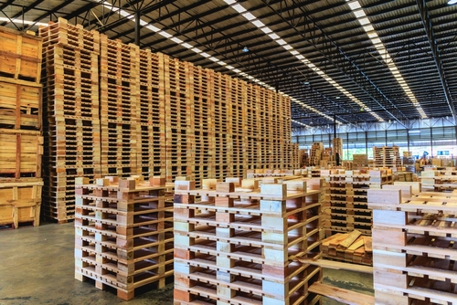
The cost is working capital tied up in dead inventory. A 9,400-SKU catalog can carry millions in stock where the slowest 20% has not moved in over 12 months. That cash cannot pay vendors. It cannot fund growth. It cannot earn a return. Meanwhile the fast movers occasionally stock out because the safety stock formula treats them the same as the slow movers, plus the team scrambles to reorder under pressure. Procurement spends its time fighting fires that better data would have prevented.
Inventory Turnover Reporting fixes the data side of the problem. The turnover ratio (cost of goods sold divided by average inventory value) calculates automatically for every SKU, category, plus location. High-turn winners surface immediately on the dashboard. Stagnant stock that has not moved in the configured threshold flags for review. The purchasing director gets a ranked list of candidates to discontinue, reduce, or relocate. CFOs receive a working-capital impact estimate for each decision. Reorder rules plus safety stock levels then get tuned against actual movement.
How does the turnover engine handle standard costing plus real-time valuation in the same calculation?
Turnover ratio math depends on the cost of goods sold plus the average inventory value, both expressed in money. The choice of valuation method changes the value side of that equation. A business running standard costing assigns a fixed unit cost per SKU set quarterly or annually. A business running real-time valuation uses FIFO, LIFO, or Weighted Average from Stock Valuation as the live unit cost. Turnover reporting reads either source automatically based on what the controller has configured for each SKU.
The same engine handles mixed environments. Some SKUs may run standard costing for budgeting purposes while raw material commodities run real-time Weighted Average to track market shifts. The turnover report respects each SKU's cost method when calculating the ratio. The output is a single comparable turnover metric across the catalog even when different SKUs use different costing approaches underneath. Purchasing plus finance see one ranked list rather than two parallel views that need reconciling at quarter-end.
Visualization makes the analysis actionable. Bar charts rank SKUs or categories by turnover. Trendlines show how turnover for a specific item has shifted over the last 12 months. Filters cut the view by vendor (which vendor's products move fastest), by warehouse (which site is sitting on dead stock), by classification (where slow-moving inventory concentrates by category), or by movement type. The result is a quarterly review meeting where everyone is looking at the same data plus the same chart, not arguing about whose spreadsheet is right.
What apps does Inventory Turnover Reporting connect to inside FireFlight?


Turnover data shapes purchasing decisions. We treat it that way.
Reporting data lives in encrypted storage hosted by PCG. Role-based access separates purchasing staff who read the turnover charts from controllers who reconcile against the financial books plus regional managers who get their own scoped view. Sensitive cost data can be restricted at the user level.
Every report run, every export, plus every filter applied is logged with user identity, timestamp, plus the date range queried. The export packet carries a watermark with the export date plus the underlying parameters, so the working paper landing in a quarterly review meeting can be traced back to its exact source query without ambiguity.

Ikhana shows your team how to run a turnover report, filter by category, plus export the chart for the next quarterly review.
Every field, every filter, every chart option is explained the moment somebody asks. New purchasing analysts run their first dead-stock report the same week they start. No training queue. No tickets to IT.
Learn more about IkhanaWhat does Inventory Turnover Reporting give your purchasing plus finance teams?
 Turnover ratio tracked by SKU, category, or location. One comparable metric ranks the catalog regardless of which costing method each SKU uses underneath.
- High-turn versus stagnant items highlighted on every dashboard. Top movers plus dead stock surface immediately instead of getting buried in the catalog list.
- Monthly, quarterly, or custom date ranges. Match the report period to the quarterly review, fiscal close, or seasonal analysis window your team needs.
- Visual dashboards with bar charts plus trendlines. The chart that lands in the executive review tells the story without a five-page narrative attached.
- Exportable reports formatted for purchasing plus finance teams. CSV for analytical work, PDF for the formal review packet, plus structured exports for downstream BI.
- Direct connection to reorder plus safety stock planning. Fast-moving SKUs get tighter reorder triggers; slow movers can be pulled from the auto-reorder list entirely.
- Filters for vendor, warehouse, classification, or movement type. Slice the analysis by whichever cut the team needs in the moment.
- Works with standard costing or real-time valuation. Each SKU's chosen cost method feeds the turnover calculation without any reconciliation between models.
"We used turnover trends to cut 22% of slow-moving SKUs, freeing up both space plus cash."Director of PurchasingNational Retail Chain
31 years of operational software, with AI reporting built in for 2026.
Phoenix Consultants Group has built custom operational software since 1995. Inventory Turnover Reporting is one app inside the FireFlight platform, the same platform running fleet fueling for municipal operators, physician credentialing for staffing firms, plus airport ground equipment management for aviation services.
The AI layer added in 2026 means a CFO can query Inventory Turnover Reporting in plain English. "Show me every SKU with a turnover ratio below 1.5 in the last two quarters, grouped by warehouse plus by vendor, with the working capital tied up in each." The system answers from live data. No report request to IT. No waiting.
What changes operationally after Inventory Turnover Reporting goes live?
- Dead stock stops accumulating without being noticed. Stagnant items flag every quarter for review, plus the purchasing team has a ranked list ready before each meeting.
- Working capital gets freed up. Slow-moving SKUs identified through turnover analysis can be discontinued, marked down, or relocated to lower-cost storage.
- Reorder rules tighten on winners. The fast-turn SKUs that occasionally stock out get tighter triggers plus more responsive safety stock formulas.
- Quarterly reviews become decision meetings, not data-cleaning meetings. Purchasing plus finance arrive with the same numbers.
- Vendor negotiations get grounded in data. Procurement walks into the next vendor meeting with the turnover history of that vendor's catalog in hand.
Frequently Asked Questions
How is Inventory Turnover Reporting different from Custom Reporting?
How is Inventory Turnover Reporting different from Custom Reporting?
How is turnover ratio calculated?
How is turnover ratio calculated?
Can the same report mix SKUs on standard costing with SKUs on real-time valuation?
Can the same report mix SKUs on standard costing with SKUs on real-time valuation?
What counts as a stagnant SKU?
What counts as a stagnant SKU?
How does turnover data feed reorder plus safety stock decisions?
How does turnover data feed reorder plus safety stock decisions?
Can we filter turnover by vendor for negotiation prep?
Can we filter turnover by vendor for negotiation prep?
How long does Inventory Turnover Reporting take to deploy?
How long does Inventory Turnover Reporting take to deploy?
Phoenix Consultants Group founded 1995. FireFlight Data Systems is the proprietary modular platform hosted by PCG. Page prepared May 2026.